
How to Achieve 98+ Mobile PageSpeed on WordPress Without Broken Layouts
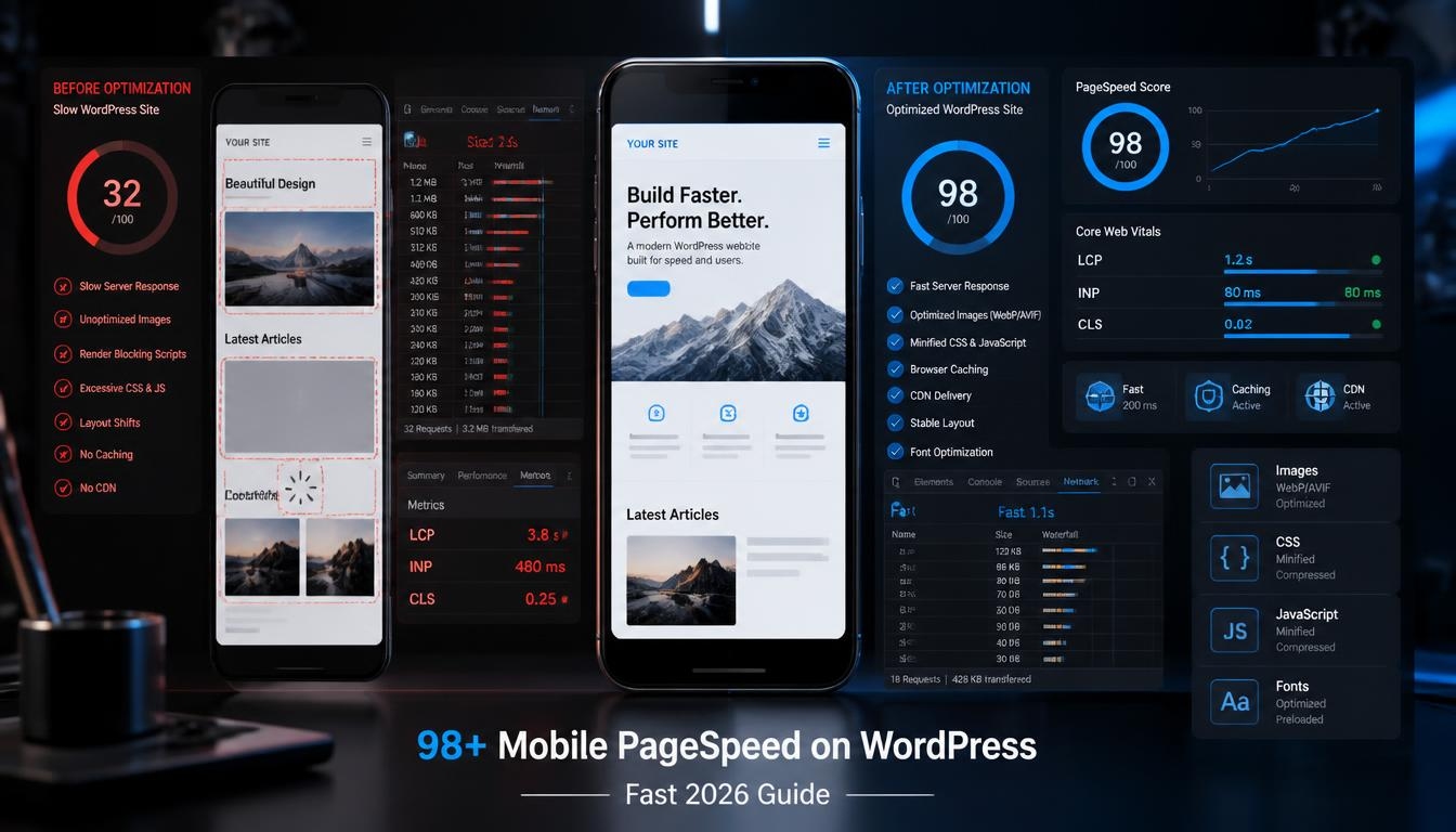
98+ Mobile PageSpeed on WordPress sounds almost impossible until you stop treating PageSpeed as a single “make my website faster” problem.
A WordPress site can have a lightweight theme and still score badly because of a huge hero image, a poorly configured cache, third-party scripts, web fonts, a bloated page builder, or JavaScript that blocks the main thread. Worse, some speed optimizations can make the score look better while quietly breaking menus, sliders, forms, animations, or mobile layouts.
That’s the real challenge.
You don’t want a fast website that looks broken. You want a website that loads quickly, responds quickly, stays visually stable, and still looks exactly the way it should on a phone.
In this guide, we’ll take a practical approach to achieving a 98+ mobile PageSpeed score on WordPress without blindly enabling every optimization checkbox you can find.
We’ll cover the Core Web Vitals that actually matter, image optimization, caching, CSS and JavaScript, fonts, third-party scripts, mobile layout stability, plugin management, testing methodology, and a safe optimization sequence you can follow without turning your website into a debugging project.
One important distinction comes first: PageSpeed Insights and Core Web Vitals aren’t the same thing. PageSpeed Insights combines real-user Chrome User Experience Report data with Lighthouse lab testing. The familiar 0–100 performance score is a lab-oriented diagnostic, while Core Web Vitals tell you how real visitors experience loading, responsiveness, and visual stability.
So yes, let’s aim for 98+.
But let’s do it intelligently.
What a 98+ Mobile PageSpeed Score Really Means
Let’s clear up one common misconception.
A PageSpeed score of 98 doesn’t mean your website is automatically excellent. Likewise, a score of 82 doesn’t mean your site is slow for every visitor.
PageSpeed Insights uses Lighthouse for lab testing and CrUX for real-world user data. Lab testing is useful for diagnosing problems under controlled conditions, while field data reflects what actual Chrome users experienced.
That’s why I recommend using three targets instead of one:
- PageSpeed mobile: aim for 90+, with 98+ as an ambitious optimization target.
- LCP: 2.5 seconds or less.
- INP: 200 milliseconds or less.
- CLS: 0.1 or less.
Google’s current Core Web Vitals guidance uses those thresholds for a good user experience.
The three metrics you should care about
LCP — Largest Contentful Paint
LCP measures when the largest visible content element has rendered. On many WordPress pages, that’s the hero image, featured image, heading, or large text block. Google recommends an LCP of 2.5 seconds or less at the 75th percentile.
INP — Interaction to Next Paint
INP measures responsiveness. If someone taps a menu button and the page takes too long to respond, the experience feels sluggish even if the page visually loaded quickly. A good INP is 200 milliseconds or less.
CLS — Cumulative Layout Shift
CLS measures unexpected movement of page content. Think about the classic experience: you try to tap a button, an image suddenly appears above it, and the button jumps downward.
That’s a layout shift.
Google recommends a CLS of 0.1 or less. Common causes include images without dimensions, dynamically inserted content, ads, embeds, and web fonts.
And there’s an important SEO reality here.
Google explicitly says that good Core Web Vitals don’t guarantee top rankings. Search systems consider many signals, and Google recommends improving page experience for users rather than chasing a perfect score purely for SEO.
That distinction will save you from wasting hours.
Measure Your WordPress Site Before Changing Anything
The fastest way to waste an afternoon is to start optimizing before you know what’s actually slow.
Run your important URLs through PageSpeed Insights first.
Don’t test only your homepage.
Test at least:
- Homepage
- One blog post
- One category/archive page
- A landing page
- A product page, if applicable
- Your most important traffic page
Record the mobile results.
For each URL, write down:
| Metric | Before Optimization |
|---|---|
| Performance score | Your result |
| LCP | Your result |
| INP | Your result |
| CLS | Your result |
| TTFB | Your result |
| Total page size | Your result |
| Number of requests | Your result |
This creates a baseline.
Why repeated testing matters
PageSpeed isn’t a fixed stopwatch.
Network conditions, server load, cache state, third-party services, and test conditions can affect lab results. Field data is also not real-time; PageSpeed Insights’ CrUX data represents a trailing period rather than the result of a single instant test.
So don’t celebrate because one test says 99.
Run several tests.
A useful practical method is:
- Test three times.
- Record the scores.
- Ignore the single best result.
- Compare the average and the worst result.
- Re-test after every major change.
This gives you a much more realistic picture.
Look at the waterfall, not just the number
If your page scores 72, the number doesn’t tell you what to fix.
The diagnostic details might reveal:
- An enormous hero image
- Render-blocking CSS
- Too much JavaScript
- Slow server response
- Unused CSS
- Third-party tracking
- A font taking too long to download
- A slider loading several images
- A plugin making unnecessary requests
The goal isn’t to “fix PageSpeed.”
The goal is to identify the largest bottleneck.
Fix Hosting, Caching, and Server Response First
Here’s an optimization mistake I see repeatedly: people spend hours minifying CSS while their server takes 1.8 seconds to start responding.
That’s backwards.
Your browser can’t render useful content until it receives the necessary HTML and resources.
Google’s LCP documentation highlights the importance of time to first byte and explains that delays before the browser receives the document affect everything that follows.
Step 1: Choose adequate hosting
Cheap hosting isn’t automatically bad.
But extremely crowded shared hosting can become a problem when your site has:
- WooCommerce
- Page builders
- Large databases
- Membership features
- Heavy plugins
- Multiple dynamic requests
If your server is consistently slow under normal conditions, no amount of CSS minification will completely solve the problem.
Step 2: Enable full-page caching
For relatively static WordPress pages, page caching can be one of the biggest performance improvements available.
Instead of rebuilding the WordPress page from PHP and database queries for every visitor, the server can deliver a cached version.
WordPress’s own performance documentation recommends caching and explains that static cached pages reduce the processing load on the server.
Depending on your hosting environment, you might use:
- Server-level page caching
- A WordPress caching plugin
- CDN edge caching
- Object caching
- Browser caching
The important part isn’t installing five caching plugins.
Use one coherent caching strategy.
Step 3: Use a CDN when it makes sense
A CDN can reduce the physical distance between your visitors and cached assets.
This is especially useful when your audience is geographically distributed.
For example, if your WordPress server is in the United States but most visitors are in India, Europe, or Southeast Asia, delivering static assets from closer edge locations can reduce network latency.
Step 4: Don’t confuse cache with optimization
Caching helps deliver pages faster.
It doesn’t magically make a 5 MB webpage small.
You still need to optimize:
- Images
- CSS
- JavaScript
- Fonts
- HTML
- Third-party scripts
Think of caching as the foundation, not the entire house.
Optimize Images Without Destroying Visual Quality
Images are one of the easiest places to gain performance.
They’re also one of the easiest places to break a website.
A common mistake is uploading a 3000–5000 pixel image because “WordPress will resize it.”
Maybe it will.
But why make the browser or server deal with unnecessary data in the first place?
Use the right dimensions
If your mobile content column is roughly 390 pixels wide, serving a 2500-pixel-wide image for a small card is wasteful.
Use responsive image sizes so browsers can choose an appropriate source.
WordPress already has built-in image optimization and responsive-image functionality, and its loading optimization system considers attributes such as loading, fetchpriority, and decoding. WordPress also requires image dimensions when applying these optimizations to help avoid layout shifts.
Use modern image formats
WebP is widely supported and can significantly reduce file size compared with JPEG at comparable visual quality. WordPress’s Performance team has reported an average reduction of around 30% for WebP versus JPEG in its default-generation discussion.
AVIF can also produce excellent compression, although your exact workflow should account for browser support, image processing, CDN behavior, and compatibility.
Don’t obsess over one format.
Compare the final visual quality and file size.
Don’t lazy-load your LCP image
This is one of those details that can make or break mobile performance.
Lazy loading is useful for images below the fold.
But if your largest visible image is lazy-loaded, you’ve effectively told the browser:
“Don’t load the thing the visitor needs to see first.”
Google’s LCP documentation recommends making the LCP resource discoverable early and warns about unnecessary resource-load delay.
WordPress has increasingly sophisticated loading optimization behavior, including fetchpriority="high" and heuristics around lazy loading.
Still, always inspect the actual generated HTML.
A practical image strategy
For each page:
Above the fold
- Compress aggressively but visibly losslessly.
- Serve the correct dimensions.
- Avoid unnecessary lazy loading.
- Prioritize the LCP resource when appropriate.
Below the fold
- Use lazy loading.
- Use responsive image sizes.
- Compress files.
- Use modern formats.
Decorative images
Ask whether you need them at all.
Removing an unnecessary image is better than optimizing it.
Improve LCP Without Breaking the Mobile Layout
LCP is often where a WordPress site either wins or loses.
Suppose your homepage has:
- A logo
- Navigation
- A large hero image
- A heading
- A paragraph
- A CTA button
- Three marketing cards
If the hero image is the LCP element, getting that image discovered quickly matters.
Google recommends making important LCP resources discoverable from the initial HTML whenever possible. If an image is hidden behind JavaScript or only becomes discoverable after another stylesheet or script executes, its loading can be delayed.
Avoid JavaScript-dependent hero sections
Fancy sliders can look impressive.
But if your main headline and hero image only appear after JavaScript executes, you’ve created unnecessary work before the visitor gets meaningful content.
A simple static hero can outperform an animated carousel while looking just as professional.
Be careful with preload
Preloading the LCP image can help when the browser wouldn’t otherwise discover it early enough.
But don’t preload everything.
Google specifically warns that excessive preloading can create bandwidth contention, particularly on slower connections.
A good rule is:
Preload only resources you can confidently identify as critical.
Usually, that means one important image or font—not ten.
Keep the hero structurally stable
Your mobile hero should have a predictable shape before the image finishes loading.
For example:
.hero-image {
    aspect-ratio: 16 / 9;
    width: 100%;
    height: auto;
}
The exact ratio depends on your design.
The principle is more important than the number:
Reserve the space before the content arrives.
That prevents the text and buttons below the image from jumping around.
Reduce CSS and JavaScript Without Breaking WordPress
This is the dangerous part.
You can often gain a few PageSpeed points by aggressively delaying or removing JavaScript.
You can also turn your website into a disaster.
A performance plugin may offer options such as:
- Minify CSS
- Combine CSS
- Remove unused CSS
- Defer JavaScript
- Delay JavaScript
- Minify JavaScript
- Combine JavaScript
- Remove query strings
- Optimize delivery
The temptation is obvious:
Turn everything on.
Don’t.
Why aggressive optimization breaks layouts
WordPress sites are rarely built from one clean codebase.
A typical site may contain:
- Theme CSS
- Page builder CSS
- WooCommerce CSS
- Form scripts
- Analytics
- Slider scripts
- Menu scripts
- Popup scripts
- SEO plugins
- Cookie-consent scripts
- Custom JavaScript
Some depend on one another.
If you delay a script that initializes your mobile navigation, the hamburger icon may appear but not work.
If you remove CSS required by a page builder, sections may lose their spacing.
If you defer a script required by a checkout form, the form may stop responding.
Use the “one change at a time” rule
Make one optimization.
Clear cache.
Test:
- Homepage
- Mobile menu
- Desktop menu
- Forms
- Buttons
- Search
- Blog posts
- Images
- Sliders
- Popups
- WooCommerce checkout, if applicable
Then move to the next optimization.
It feels slower.
In reality, it’s usually faster than spending two hours trying to discover which of twelve simultaneous changes broke the header.
Start with delay, not deletion
If a script isn’t needed immediately, delaying it can often be safer than removing it entirely.
Third-party analytics, social widgets, chat tools, and marketing scripts are common candidates.
But test them individually.
Control Fonts, Plugins, and Third-Party Scripts
A beautiful font can cost you performance.
So can a chat widget.
So can an analytics platform.
So can a social media feed.
None of these are inherently bad.
The problem is accumulation.
Fonts
Every font variation can introduce another resource.
A website using:
- Regular
- Medium
- Semi-bold
- Bold
- Italic
may be loading considerably more than necessary.
If the design can work with two weights, use two.
Where appropriate, self-host fonts and serve modern WOFF2 files.
Font loading can also affect layout stability. Google specifically identifies web fonts as a possible cause of CLS and discusses techniques such as appropriate fallback fonts, font-display, and carefully chosen preloading.
Plugins
Don’t judge plugins by their quantity alone.
A site with 25 well-coded plugins can outperform a site with 12 poorly optimized ones.
The better question is:
“What does this plugin load on the front end?”
WordPress’s own optimization guidance recommends reviewing unnecessary plugins and selectively disabling them to identify performance impact.
For every plugin, ask:
- Is it necessary?
- Does it load CSS everywhere?
- Does it load JavaScript everywhere?
- Can it be limited to specific pages?
- Is another plugin already providing the same feature?
Third-party scripts
These are frequently overlooked.
Examples include:
- Google Analytics
- Advertising scripts
- Facebook/Meta scripts
- Chat widgets
- YouTube embeds
- Social feeds
- Heatmaps
- A/B testing tools
- Affiliate widgets
Each external service can introduce network requests and JavaScript work.
The best optimization is sometimes surprisingly simple:
Remove the third-party service you don’t actually use.
Fix CLS and Preserve a Stable Mobile Layout
If your goal is 98+ Mobile PageSpeed on WordPress without broken layouts, CLS deserves special attention.
Imagine this sequence:
- The page loads.
- The visitor sees a button.
- A banner appears above it.
- The button moves.
- The visitor taps the wrong element.
That’s a performance problem and a usability problem.
Give images explicit dimensions
Google recommends providing image dimensions or reserving space using CSS such as aspect-ratio. This allows the browser to calculate the image’s space before the image finishes loading.
Reserve ad space
Advertising is particularly challenging because the final ad dimensions may vary.
Still, reserving a predictable area is usually better than allowing the page to jump when an ad arrives.
Google’s CLS guidance specifically recommends reserving space for late-loading ads and embeds.
Be careful with cookie banners
Cookie notices can shift content if they are inserted into the document flow.
Where appropriate, use a fixed or overlay presentation rather than pushing the entire page downward.
Watch mobile headers
A common WordPress problem is a mobile header whose height changes after:
- Fonts load
- Sticky navigation activates
- A logo changes size
- A promotional bar appears
- JavaScript initializes
Keep the header dimensions predictable.
Avoid layout-triggering animations
Animating top, left, width, or other layout-related properties can cause expensive layout work.
Where appropriate, use composited properties such as transform and opacity.
Google’s guidance on debugging layout shifts also identifies animations, late stylesheets, images without dimensions, and dynamically inserted content as common sources of instability.
A Safe 98+ Mobile PageSpeed Optimization Workflow
Now let’s put everything together.
If I were optimizing a WordPress site from scratch, I wouldn’t begin by installing another optimization plugin.
I’d follow this sequence.
Step 1: Establish a baseline
Test important URLs on mobile.
Record:
- PageSpeed score
- LCP
- INP
- CLS
- TTFB
- Page size
- Major opportunities
Step 2: Fix obvious problems
Before touching advanced settings:
- Delete unused plugins.
- Remove unnecessary widgets.
- Compress huge images.
- Remove unnecessary fonts.
- Remove unused third-party scripts.
These changes are low-risk and often produce immediate gains.
Step 3: Fix hosting and caching
Configure:
- Page cache
- Browser cache
- CDN where appropriate
- Object cache if your application benefits from it
- Efficient PHP/database configuration
WordPress documentation identifies caching as one of the fundamental ways to reduce server processing and improve delivery speed.
Step 4: Optimize the LCP element
Identify the actual LCP element.
Don’t guess.
Then:
- Make it discoverable early.
- Serve the correct size.
- Compress it.
- Avoid unnecessary lazy loading.
- Consider preload only if justified.
- Remove JavaScript dependencies from the critical rendering path.
Step 5: Optimize CSS
Start conservatively.
- Minify CSS.
- Remove genuinely unused CSS.
- Generate critical CSS if your optimization system does this reliably.
- Avoid combining everything merely because the option exists.
Modern HTTP delivery means blindly combining every CSS file isn’t automatically beneficial.
Step 6: Optimize JavaScript
Then:
- Minify JavaScript.
- Defer non-critical scripts.
- Delay third-party scripts where safe.
- Remove scripts from pages where they’re unnecessary.
- Test interactive elements after every change.
Step 7: Fix layout stability
Check:
- Images
- Iframes
- Ads
- Embeds
- Fonts
- Sticky headers
- Cookie banners
- Popups
Reserve space wherever content can appear later.
Step 8: Test real interactions
Don’t stop at PageSpeed.
On an actual phone, test:
- Menu
- Search
- Forms
- Buttons
- Accordions
- Sliders
- Sticky navigation
- Checkout
- Login
- Popups
A 99 score is meaningless if the visitor can’t open the menu.
Step 9: Retest
Run PageSpeed again.
Then compare the baseline.
If you move from:
68 → 84 → 91 → 96 → 98
that’s excellent.
If you go:
68 → 99 → broken navigation
you haven’t optimized the website.
You’ve optimized the benchmark.
Step 10: Verify field data
Finally, check Search Console’s Core Web Vitals reporting and real-user data when available.
Google recommends using Search Console alongside other performance tools to understand how pages perform in the real world.
That’s the final test.
Pros and Cons of Aggressive WordPress Optimization
Chasing a very high mobile PageSpeed score has legitimate advantages.
Pros
Faster perceived loading
Optimizing the critical rendering path can make pages feel substantially faster.
Better mobile usability
Reducing unnecessary JavaScript and large resources can improve responsiveness, especially on less powerful phones.
Lower bandwidth consumption
Smaller images, fewer scripts, and efficient caching reduce data transfer.
Potentially better conversion experience
A faster checkout, landing page, or product page can remove friction.
Healthier technical foundation
Performance work often exposes unnecessary plugins, excessive scripts, and inefficient assets that should have been cleaned up anyway.
Cons
Optimization can break functionality
Aggressive JavaScript delay and CSS removal can create subtle bugs.
Higher maintenance
A carefully optimized site may require retesting after theme, plugin, or WordPress updates.
A 98 score isn’t the goal itself
Google explicitly warns against treating a perfect score as the primary objective. Real-user experience and overall page experience matter more.
Third-party services remain difficult
You may not have complete control over how external scripts behave.
Diminishing returns
Moving from 55 to 85 can be transformative.
Moving from 95 to 99 may require disproportionate effort.
That’s why I prefer a simple rule:
Optimize until the user experience is excellent, then stop chasing points.
Frequently Asked Questions
Can I really achieve 98+ Mobile PageSpeed on WordPress?
Yes, many lightweight WordPress pages can reach the high 90s in Lighthouse mobile testing. However, the achievable score depends on the theme, hosting, page builder, images, plugins, third-party scripts, and page complexity.
Is a 98+ PageSpeed score necessary for Google rankings?
No. Google recommends good Core Web Vitals and overall page experience, but it doesn’t require a PageSpeed score of 98 or 100. Google also states that good page-experience metrics don’t guarantee top search rankings.
What is the most important Core Web Vital for WordPress?
There isn’t one universal metric. LCP measures loading, INP measures responsiveness, and CLS measures visual stability. A good WordPress site should aim for LCP of 2.5 seconds or less, INP of 200 milliseconds or less, and CLS of 0.1 or less.
Should I lazy-load every image on WordPress?
No. Images below the fold are good candidates for lazy loading, but your LCP image generally shouldn’t be unnecessarily delayed. WordPress has built-in loading optimization logic, so inspect the generated markup rather than applying a blanket rule to every image.
Can too much JavaScript hurt mobile PageSpeed?
Absolutely. Large or poorly timed JavaScript can delay rendering and user interactions. Google notes that script parsing, compilation, and execution can create long tasks that increase interaction latency and hurt INP.
Do caching plugins guarantee a 98+ score?
No. Caching can significantly reduce server processing and improve delivery, but it doesn’t automatically optimize images, JavaScript, fonts, third-party scripts, or layout stability. A complete performance strategy usually needs several complementary improvements.
Does Rank Math slow down WordPress?
Rank Math states that its SEO plugin is designed not to negatively affect front-end performance and that its free and Pro versions don’t load front-end JavaScript or CSS for their core functions. Nevertheless, your site’s overall performance should always be measured before and after major plugin changes rather than assumed.
Why does my PageSpeed score change every time I test?
Lab results can vary because of testing conditions, server load, caching, network behavior, and other factors. PageSpeed Insights also separates lab Lighthouse results from real-user CrUX data, so one test shouldn’t be treated as the definitive performance measurement.
Final Verdict
Achieving 98+ Mobile PageSpeed on WordPress isn’t about finding one magical plugin.
It isn’t about turning every optimization setting to maximum.
And it definitely isn’t about sacrificing your design just to see a green number.
The strongest WordPress performance improvements usually come from a sequence of sensible decisions:
Fast hosting → caching → optimized images → efficient LCP delivery → controlled CSS → controlled JavaScript → fewer third-party scripts → stable layouts → repeated testing.
The most important lesson is that performance and design don’t have to fight each other.
You can have a beautiful website with animations, high-quality images, custom fonts, forms, menus, and modern UI—and still build it efficiently.
The trick is deciding what needs to load immediately and what can wait.
Your logo doesn’t need to compete with a social widget.
Your hero image shouldn’t wait behind a marketing script.
A below-the-fold image doesn’t need to download before the visitor can see the headline.
A chat widget doesn’t need to execute before the navigation works.
And a font doesn’t deserve priority over the content your visitor came to read.
That’s how you approach 98+ Mobile PageSpeed on WordPress without creating a fragile website.
Start with one important page today. Record its baseline, identify its biggest bottleneck, make one controlled improvement, and test again.
Don’t chase the number.
Build a faster website that still works beautifully.
That is the performance target worth keeping.
Specializing in AI applications, web architecture, high-performance WordPress infrastructure, and modern productivity tooling.
Discussion & Feedback 0
Join the technical conversation. Constructive questions, benchmarks, and experiences are welcome.
No Comments Yet
Have questions about this guide, discovered a better tool alternative, or benchmarked results? Be the first to start the discussion!